A simple Bulma theme color picker
(Impatient? Find the Bulma Theme Color Picker here)
Bulma is great
I'm a big fan of Bulma. It's clean-and-simple-looking yet very customizable. But customizing was always a bit of a hassle, and you had to create your own version to include in your project.
Since version 1.0, however, Bulma is heavily based on CSS variables. That makes customization really simple. Your CSS file could look like this:
@import url('https://cdn.jsdelivr.net/npm/bulma@1.0.4/css/bulma.min.css');

.section {
  --bulma-section-padding-desktop: 1.5rem 1.5rem;
  ... more customizations
}
The first line imports the standard 1.0.4 version of Bulma from a central location; the rest sets various CSS variables that change the standard behavior. That makes two things to like: importing from a CDN is fast and chances are the file is already in the clients cache, and the changes are really compact and to the point. No need to make a copy of the whole of Bulma just to change the section spacing!
But apart from this one change, I usually just want a (slightly) different color scheme. The default one is fine, but it's used all over the place. And as it happens, customizing the colors is a little harder, mainly because Bulma uses HSL-representations of colors. To set the danger color to bright red, for example, you can't just set it to #ff0000 (or red) , but you have to do:
:root {
  /* danger: #ff0000 */
   --bulma-danger-h: 0deg;
   --bulma-danger-s: 100%;
   --bulma-danger-l: 50%;
}
since #ff0000 is hsl(0deg 100% 100%) in CSS. (Overrides that affect the whole of Bulma, not just one component, go in the pseudo :root selector).
Also, experimenting with different colors is best done while previewing the changes live, so you can see them in combination - and preferably also, in both light and dark modes.
Customizing with preview
Enter the MOBZystems™ Bulma Theme Color Picker! It shows you the main Bulma styles (primary, info, link, succes, warning, danger, dark, light, black, white) as well as outlined, inverted, dark and light versions:
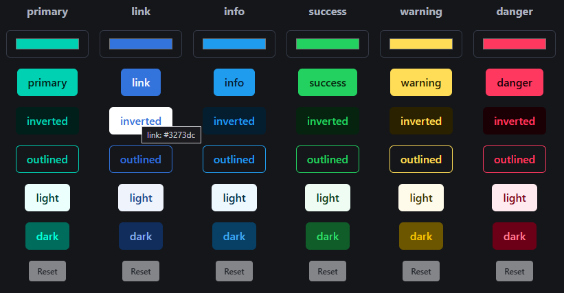
You can switch the page to light mode, and you'll see:
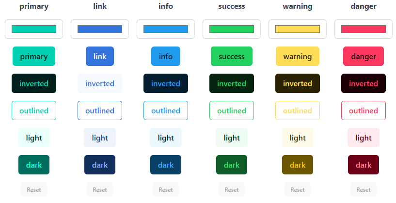
Clicking on a button will show a color picker, which takes effect immediately. There's also a sample of a web page below the buttons that shows how notifications and messages look in your shiny new theme.
Export CSS
This is already an improvement on Bulma's own customizer, which does not show a color picker (just sliders for HSL values) and doesn't offer a preview. But it does allow you to export just the CSS rules you changed. We can do that, too!
While you are picking colors in the Bulma Theme Color Picker, the necessary CSS rules are generated on the fly. You can copy them to your own stylesheet in the same way as Bulma's own customizer. The default colors look like this:
@import url(https://cdn.jsdelivr.net/npm/bulma@1.0.4/css/bulma.min.css);

/*
 Created with Simple Bulma Theme Color Picker (https://www.mobzystems.com/online/a-simple-bulma-theme-color-picker/).
 To change: use the JSON below to import your theme there

{ "primary": "#00d1b2", "link": "#3273dc", "info": "#209cee", "success": "#23d160", "warning": "#ffdd57", "danger": "#ff3860",
"light": "#f5f5f5", "dark": "#363636", "black": "#000000","white": "#ffffff" }

*/

/* Bulma overrides */

:root {

  /* primary: #00d1b2 (default) */
  --bulma-primary-h: 171deg;
  --bulma-primary-s: 100%;
  --bulma-primary-l: 41%;

  /* link: #3273dc (default) */
  --bulma-link-h: 217deg;
  --bulma-link-s: 70.8%;
  --bulma-link-l: 52.9%;

  /* info: #209cee (default) */
  --bulma-info-h: 204deg;
  --bulma-info-s: 85.8%;
  --bulma-info-l: 52.9%;

  /* success: #23d160 (default) */
  --bulma-success-h: 141deg;
  --bulma-success-s: 71.3%;
  --bulma-success-l: 47.8%;

  /* warning: #ffdd57 (default) */
  --bulma-warning-h: 48deg;
  --bulma-warning-s: 100%;
  --bulma-warning-l: 67.1%;

  /* danger: #ff3860 (default) */
  --bulma-danger-h: 348deg;
  --bulma-danger-s: 100%;
  --bulma-danger-l: 61%;

  /* light: #f5f5f5 (default) */
  --bulma-light-h: 0deg;
  --bulma-light-s: 0%;
  --bulma-light-l: 96.1%;

  /* dark: #363636 (default) */
  --bulma-dark-h: 0deg;
  --bulma-dark-s: 0%;
  --bulma-dark-l: 21.2%;

  /* black: #000000 (default) */
  --bulma-black-h: 0deg;
  --bulma-black-s: 0%;
  --bulma-black-l: 0%;

  /* white: #ffffff (default) */
  --bulma-white-h: 0deg;
  --bulma-white-s: 0%;
  --bulma-white-l: 100%;
}
... and import, too
But what if you want to change a color scheme later on? The particular shade of purple you chose doesn't quite match the dark blue? Then you'd have to start over, if the Theme Color Picker Picker didn't support import as well. At the top of the generated CSS you'll find two lines of JSON, for example:
{ "primary": "#00d1b2", "link": "#3273dc", "info": "#209cee", "success": "#23d160", "warning": "#ffdd57", "danger": "#ff3860",
"light": "#f5f5f5", "dark": "#363636", "black": "#000000","white": "#ffffff" }
If you click the Import button, paste that bit of JSON and click on Import again, your theme will be loaded. You can then update it using the preview and export it anew.
Try it out for yourself!
Source code
As usual, the source code is on Github. It's a React vite app with Typescript - my go-to combination for web apps these days. The whole app is about 300 lines of Typescipt/React code (if you don't count the HSL conversion function and the sample HTML). That's amazing to me.